Lucie is Lovely
Thursday, 24 November 2016
Rationale
Creating my now finalized character, Dottie, and animation her was a challenging process. I have stayed true to the initial concept of Dottie throughout, whilst making small changes here and there.
The initial concept of Dottie was inspired by the cartoon series, “Little Audrey”. Little Audrey was a cheeky and mischievous little girl who spent most of her time with her maid and her dog. With Dottie, I’ve tried making a modern version of the 1960’s cartoon show. Visually, I wanted Dottie to be a Disney-style character. This meant changing the features to round eyes, with a round face and a pointed chin to emphasize her cheeky/mischievous nature. I wanted her to have very expressive eyebrows, and to do this I chose to make them very dark and thick, (as opposed to her blonde hair). I dressed her in pink, using magenta, a bright pink for excitement.pink can also connote confidence and assertiveness, but also warmth and affection. The color also seems very girls and childish , helping to make her cute.
Peer critique sessions aided the development of Dottie. For Instance, I changed the eye color to brown up until I had feedback saying that she was cuter and looked more innocent when she had blue eyes. However, for some features, I had to go with my own judgment. The color of the dress was another point that some people would have liked to be changed. Despite this, I had too many reasons to keep the dress pink as I thought it suited my animation better. I experienced with a polka dot dress but it wasn’t practical when animating, so the bright pink dress remained. The peer critique was helpful none the less as it gave me lots of ideas to experience with.
I started the modeling process with her bow (Her Prop). It was quite difficult making the shape from squares, but it turned out fine. I created it large and scaled it down when putting it on her head. The dress was a problem initially I wasn’t sure wether to extrude the skirt from her legs or to make an entirely new mesh. I stuck with the later as my brilliant lecturer advised. Creating a whole new mesh would also be easier to animate when the time came. I experimented with the possibility of making her more realistic by creating thinner limbs but once again went back to the rounder and cuter initial idea as it was more true to who I wanted Dottie to be. Her torso had to be shortened to create this effect.
I did a lot of experimenting with xGen and nHair which was actually a great learning process. However, due to time constraints and lack of experience, I had to revert to the original “solid” hair for the final product. I'm a little bit proud know that I know how to use xGne and nHair.
As I now had some experience with xGen, nConstraints, and nCloth I decided to make her dress an nCloth object. It was difficult, but I had envisaged her with a dress that flowed and bounced with her movements. _-_ through a lot of hard work, the desired design was achieved.
When it came to her walk cycle, I designed her with a skippy-ish walk to show her personality. In the concept of the story, she is always being told off by her nanny for her cheeky pranks and games, so I decided to animate her with a chirpy walk that develops into her being annoyed when her nanny calls her name. This would then end with a cheeky smirk as she knows what she has done. The bright lighting in the walk cycle is due to the fact that she lives in a massive mansion with lots of large windows. Therefore Dottie is flooded with a lot of light and in most modern houses the lights are blue and not yellow.
In conclusion, it was a challenging process with both highlights and lowlights, but all in all was very enjoyable there were quite a few tweaks and changes made due to practicality and feedback. At the end of the day the final product has stayed true to the original concept. I am quite pleased with the outcome.
Thursday, 17 November 2016
Lighting Experiment
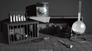
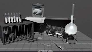
Today we did some lighting experiments, we had to light up a mad scientist scene. I went for clean and fresh. I also played around with some darker shadows.
A Wink and a Sigh
These two walk cycles are the ones I want to work on, im just not sure at this stage which one to use.
The sigh is like a cheeky sigh and then the wink is a little cheeky too. Afer all thats what she is. I am trying to get the head to not wobble as much.I didnt notice until one of my classmates pointed it out.
I was thinking with the sign it would be her nanny telling her off from a distaance for doing something and she get annoyed but shes still happy she did it.
Monday, 14 November 2016
Spline
This is the beginning of my Splining journey. I've made all the curves splines so now I am making them smoother.
Here are all my curves in the graph editor with the Spline:
Without the spline:
I am not having too many problems with this so I can say that its going good so far.
Thursday, 3 November 2016
Walk Cycles - Dottie
I've tried making a couple, to see what would feel better for her. I tried a normal walk, A skippy/fast walk, a skip and an angry walk cycle. One of the harder things to get right when doing my walks was probably the timing and getting the skirt to do what I wanted to do. I think I will be maybe going with the skippy walk. The angry walk was just my walk with different expressions and her fists are clenched.
A little bit of recap on who Dottie is. She's a little girl that lives in the posh suburbs if London with her nanny/maid because her parents are always at work and business trips etc. To her, it doesn't really bother that much that she doesn't see her parents because she's so young and doesn't know any different. She loves to occupy herself by playing pranks on her nanny and even her dog, Dot. She is usually very cheerful and cheeky. I was thinking that she could either be happy because she's having fun or maybe angry because she didn't get what she wanted, maybe it was the giant unicorn soft toy at the toy shop.
She could also be crying because she fell, you know she's just a little kid. But then she wouldn't really be walking, I'd imagine her lying on the floor crying if that happened.
So I went with her skipping along, she could be going to eat because her nanny just called her for dinner or shes at the park and walking her dog.
The first is the normal walk cycle.
This one is the angry walk. (uh-oh the dog ate her candy)
This one is a chirpy walk
This one is the skip/walk
(I still need to finish animating the hands)
Tuesday, 1 November 2016
Poses 2
This is a pose that was inspired by an image I found on google images. I decided to change the arms because we couldn't really see them, therefore, the silhouette of the pose wasn't strong enough. I decided to make the fists clenched and her arms out a little bit. In the original pose, she had her arms crossed tightly close to her chest.
Thursday, 27 October 2016
nCloth
And just a little trial:
Tuesday, 25 October 2016
Poses
After finishing my weights I had to put my chaaracter into a pose. I am not completely finished my blend shapes yet so she doesn't really have any facial expressions apart from her default.
Ball Animation
This was relatively straightforward, today I learnt how to animate in 3D so my first exercise was animation a bouncing ball.
Subscribe to:
Posts (Atom)


